The Challenge
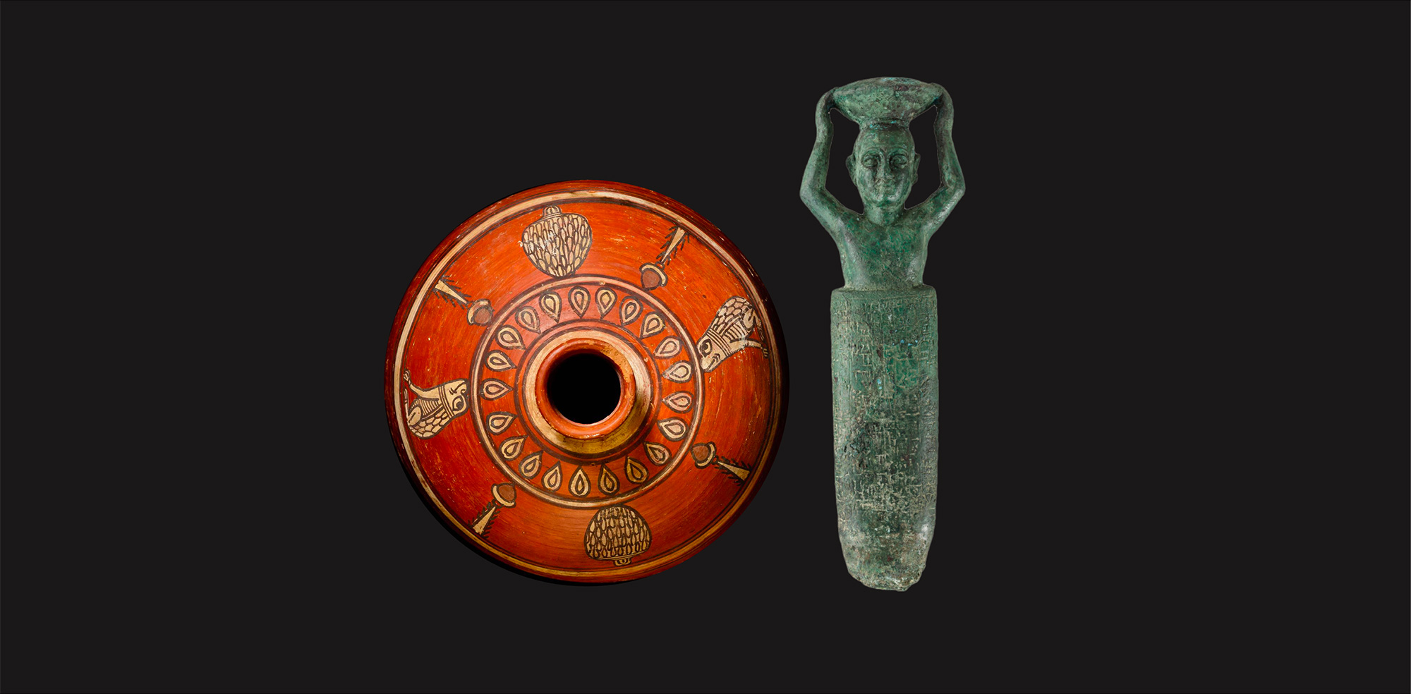
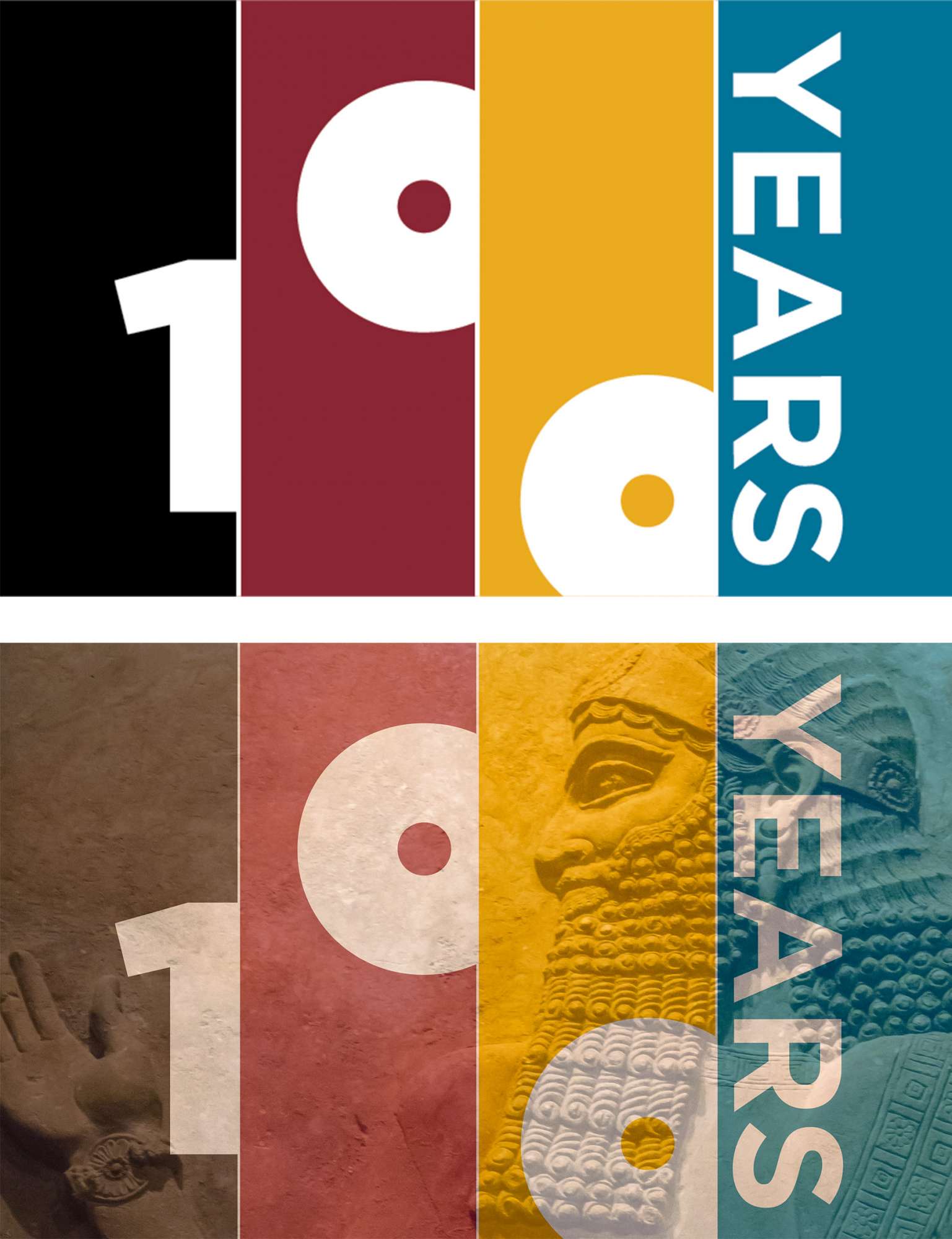
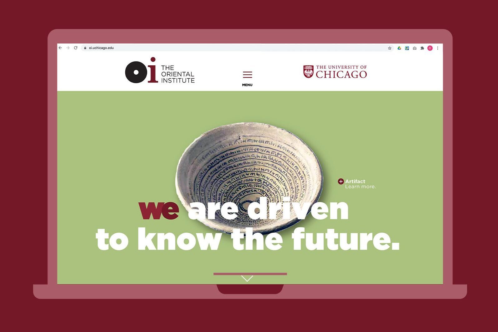
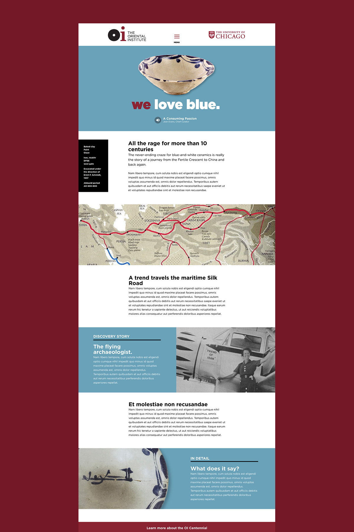
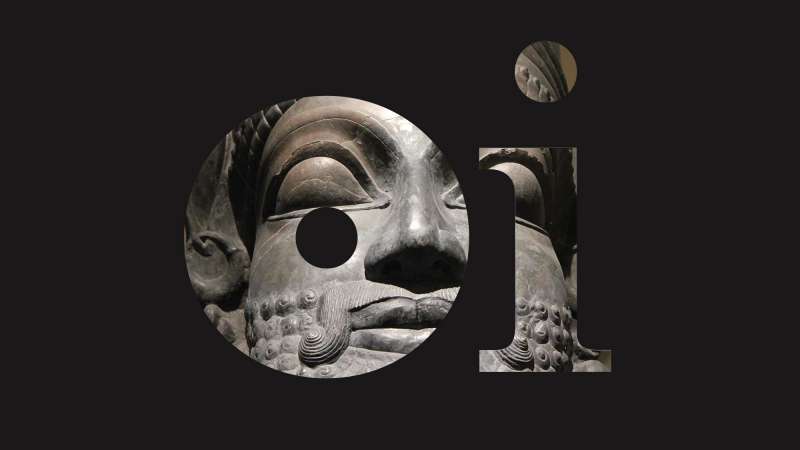
The Oriental Institute of the University of Chicago was founded with a radical idea: who we are began not in Greece or Rome, but rather in complex civilizations of the Near East. In advance of its centennial, the Oriental Institute had four goals: reinvigorate giving; make its storytelling more relevant to contemporary audiences; significantly raise the profile of its world-class museum; and popularize its name as the “OI.” Starting with the brand idea “Humans, together,” we created new messaging and a new visual vocabulary—including a more approachable OI logo inspired by the wheel, currency, and other innovations from the Fertile Crescent.
The Impact
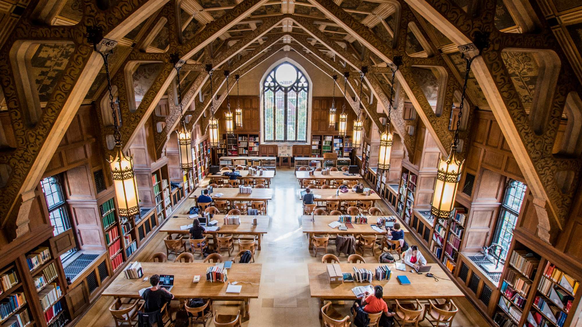
The new centennial brand became the focal point for the year-long centennial celebration and is now incorporated into everything from digital communications to the logos on docents’ shirts.
Project components
- Strategy
- Brand story and messaging
- Naming
- Institutional logo
- Brand platform
- Creative concepts